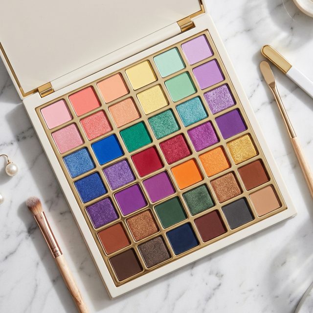
Color theory explains why some eyeshadow combinations look polished and others look muddy. A few core principles change how you shop for and use palettes.
Complementary Colors
Complementary colors sit opposite each other on the color wheel and create the highest contrast, making each other more vivid.
For eye makeup:
- Purple/plum + yellow-gold: Enhances brown and hazel eyes
- Green + copper/terracotta: Striking on green eyes
- Blue + peach/orange: Makes blue eyes appear brighter
Use the complementary color in the crease or outer corner with a neutral on the lid.
Analogous Colors
Analogous colors share undertones and blend naturally, this is why warm neutral palettes are beginner-friendly.
Examples:
- Peach → terracotta → burgundy (all warm-red)
- Sage → olive → forest (all yellow-green)
- Lilac → mauve → plum (all cool purple)
Value Contrast Creates Dimension
Value (light vs. dark) creates depth regardless of color. A look with all mid-tones appears flat.
Simple structure:
- Light: Brow bone, inner corner, center lid
- Mid-tone: Transition shade in the crease
- Dark: Outer crease, outer corner, lash line
Eye Color + Complementary Shades
| Eye Color | Best Shadow Tones | Why |
|---|---|---|
| Brown | Cool purples, blues, greens | Complement warm brown iris |
| Blue | Warm copper, peach, bronze | Warm + cool contrast |
| Green | Burgundy, rose, terracotta | Red tones enhance green |
| Hazel | Purples → more green; golds → more amber | Shifts the dominant tone |
Building a Versatile Palette
A well-rounded palette needs:
- 4–5 neutral mattes (light to dark, warm)
- 1–2 cool neutrals (taupe, grey)
- 1–2 shimmers (champagne, bronze)
- 2–3 accent colors (plum, burgundy, copper)
Picks: NYX Ultimate Shadow Palette ($18) or Urban Decay Naked3 ($54) for rose-neutrals.
How to Build a Look Using Color Theory
Knowing color theory is one thing, applying it is another. Here’s a practical framework:
Step 1: Start with Your Transition Shade
The transition shade is the bridge between your lid and brow bone. It should be a matte, medium-toned neutral, not too warm, not too cool. Apply it before any other color, blending it into the crease with a fluffy brush. This invisible foundation makes everything else easier to blend.
Step 2: Add Your Main Lid Color
This is where color theory comes in. If you want a warm, golden look, lean on analogous colors (yellows, oranges, bronzes). If you want contrast and drama, pull from the complementary side (copper on blue eyes, purple on brown eyes).
Step 3: Deepen the Outer Corner
Use a darker version of the same color family in the outer corner and crease. Dark doesn’t have to mean black, a deep plum, chocolate brown, or navy creates the same depth with more nuance.
Step 4: Highlight and Brighten
Apply a light shimmer or matte highlight to the inner corner and brow bone. This is where understanding value (light vs. dark) pays off, the contrast with your deeper crease is what creates the illusion of shape and dimension.
Common Color Theory Mistakes
Choosing shadows that are too similar in value: A look with all medium-toned shadows reads flat even if the colors are technically coordinated. Build from light to dark.
Ignoring undertones: A “nude” shadow with warm orange undertones will fight with a cool pink lip. Understand whether your colors are warm, cool, or neutral before combining them.
Forgetting that white light changes color: Eyeshadow looks different in fluorescent office lighting, warm tungsten, and outdoor daylight. If you’re doing makeup for photos, check the look under the lighting you’ll actually be photographed in.
Finishing the Look
Color theory doesn’t stop at eyeshadow. For a harmonious overall makeup look:
- Lip color should either contrast (complement) or coordinate (analogous/neutral) with your eye color scheme, not compete with it
- Blush in a warm peach grounds a cool eye look; a dusty rose blush ties into a plum eye palette
- Foundation undertone matters, warm-toned skin reads beautifully with earthy, bronze tones; cool-toned skin flatters with berries, mauves, and silvers
Related reads:
- Eyeshadow Colors for Brown Eyes
- Eyeshadow Colors for Blue and Green Eyes
- Eyeshadow Blending Techniques
Choosing the Right Product for Your Needs
When exploring eye makeup, selecting the perfect product relies heavily on understanding your skin type, undertones, and daily routine. To achieve the most flattering look, always prioritize formulas that work with your unique biology rather than against it.
Understanding Skin Types and Formulas
If you have oily eyelids, powder eyeshadows and waterproof liquid liners will be your best defense against midday creasing and smudging. For those with mature or dry skin, cream shadows and hydrating concealers offer a youthful, radiant finish that won’t settle into fine lines. Always start with a high-quality eye primer to ensure whatever formula you choose locks in place for 12+ hours. Also, applying setting powder lightly over the lids before packing on color can absorb excess sebum throughout the day, significantly extending the life of your look.
The Role of Undertones
Matching your makeup to your undertone is crucial. If you have cool undertones (veins appear blue/purple), reach for icy silvers, cool taupes, and berry hues. If your undertones are warm (veins appear green), gold, peach, bronze, and warm terracotta shades will make your eyes pop. Neutral undertones have the flexibility to wear almost any shade on the color wheel. Remember that contrasting colors on the color wheel create the most dramatic impact; for example, warm copper tones will make blue eyes appear vividly bright, while violet hues beautifully enhance green eyes or hazel eyes.
Proper Removal and Eye Health
The most important step of any makeup routine is removing it. Sleeping in eye makeup can lead to clogged hair follicles, lash loss, and severe eye infections like styes. Use a dedicated, gentle bi-phase makeup remover on a cotton pad, holding it over the closed eye for 10 seconds to dissolve waterproof bonds before gently wiping away. Never violently scrub the delicate skin around the eyes, as this accelerates premature aging and wrinkle formation. After removal, applying a hydrating, peptide-rich eye cream will restore the moisture barrier stripped away by cleansing surfactants, promoting healthy lash growth and a smoother canvas for the next day’s application.
Sources
- American Academy of Ophthalmology, Eye Health Information
- American Academy of Dermatology, Skin Care Guidelines
- National Eye Institute, Eye Health Research
Related Articles
Get weekly eye care & beauty tips
Expert-researched guides delivered to your inbox. No spam, ever.